

BRAND: OZ ARCHITECTURE
OZ Architecture has an iconic portfolio, spanning decades of innovative design solutions. Their history trails all the way back to 1964 and includes a wide array of famous Colorado destinations -in addition to both national and international projects. After merging their Boulder and Denver offices into two warehouses within Denver’s budding art district, RiNo, OZ’s brand language was due for a refresh in order to stay relevant among the young, edgy firms popping up, showing they understood the changing landscape of today’s design world.
Credits:
My role: Brand Management and Visual Design // Created at: OZ Architecture // Creative Director: Abigail Plonkey // Photography: by me
APPROACH
Using both visual and experiential design solutions, reposition OZ as artistic, cool and current, while emphasizing their Colorado-native pride, which ties the brand to its roots while simultaneously propelling it towards its future.
KEY DELIVERABLES
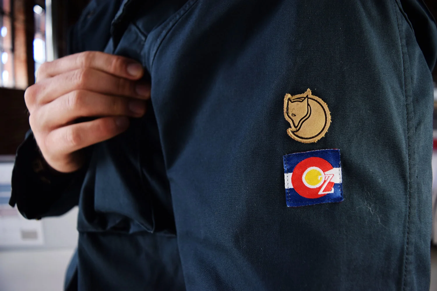
Partnerships with notable outdoor brands were cultivated for the employee holiday gifts.
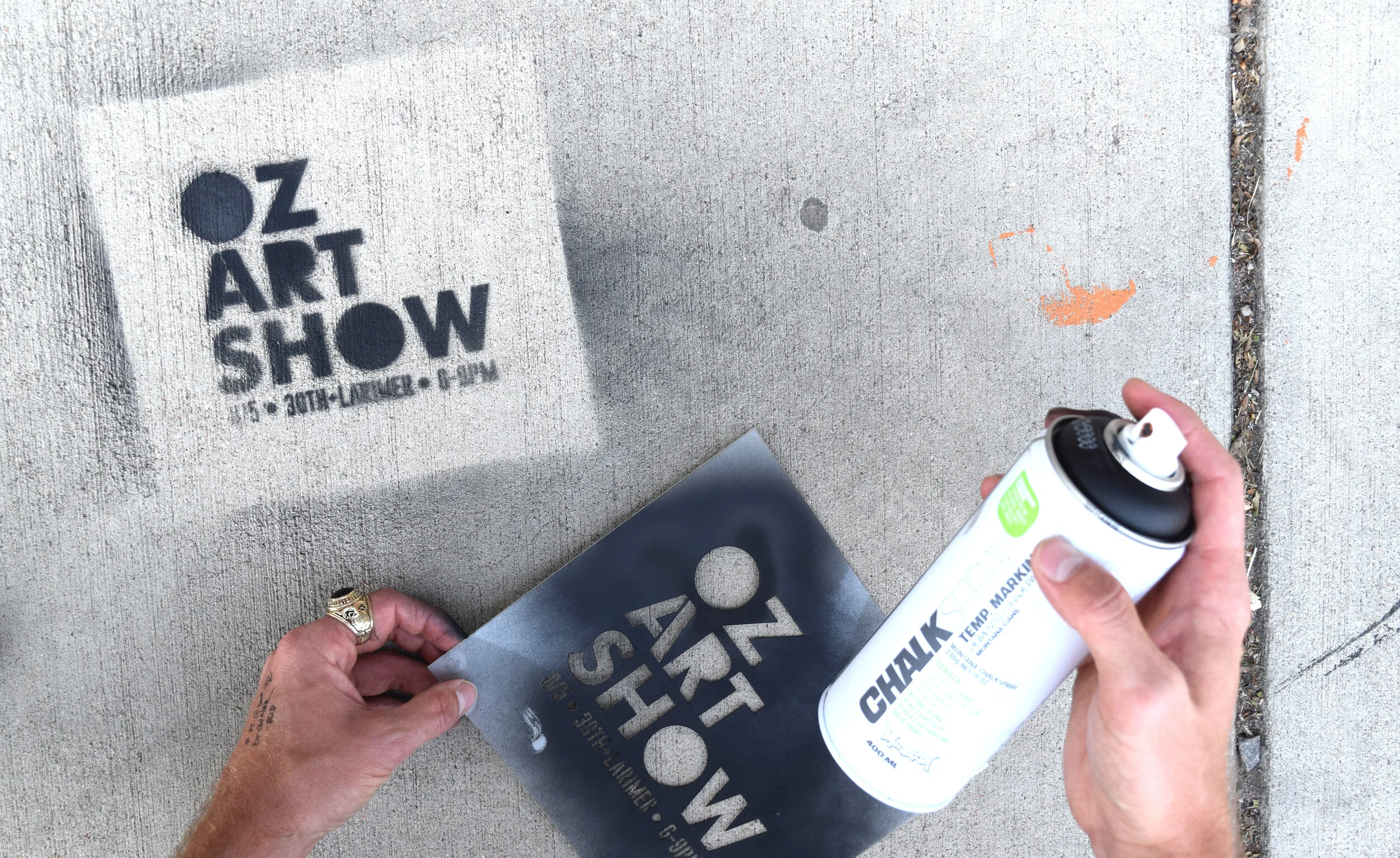
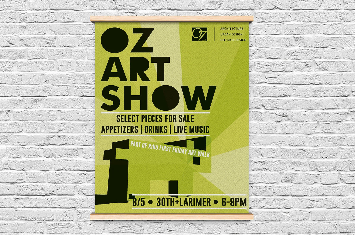
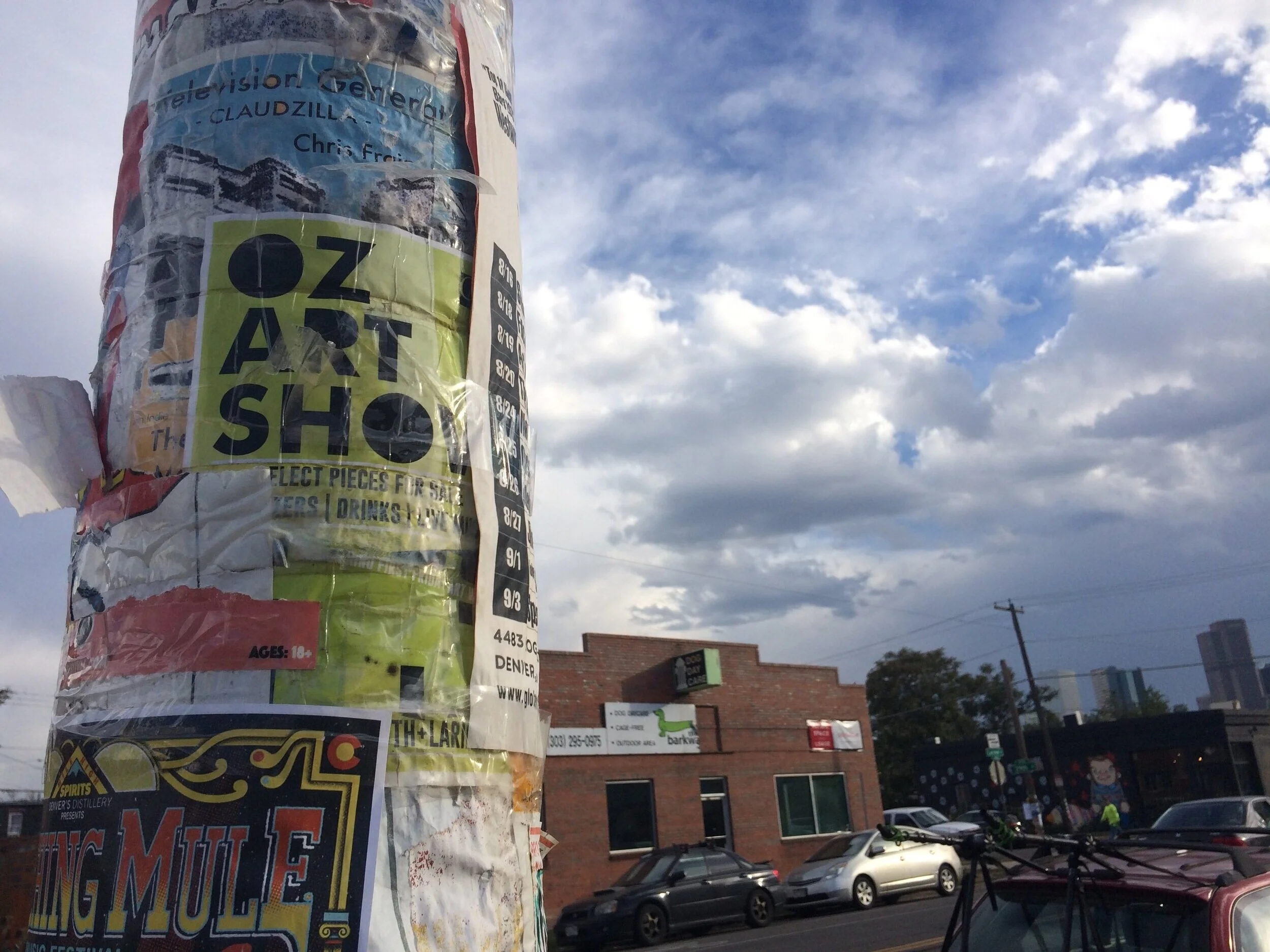
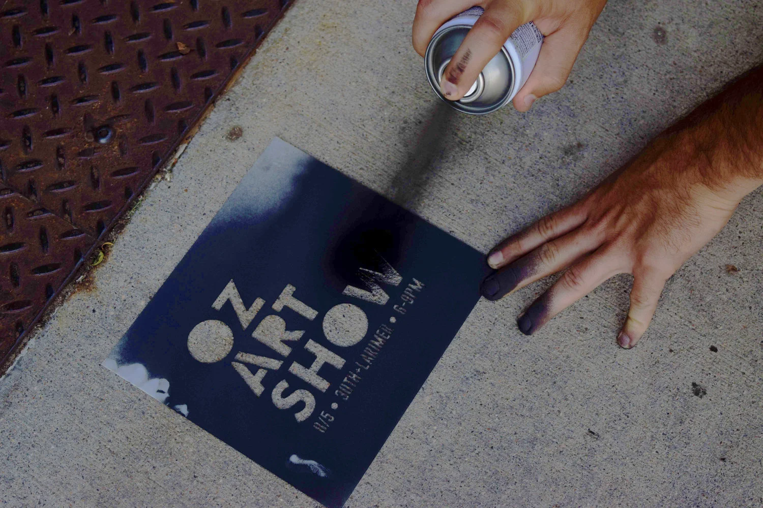
An employee driven art show began to reinforce the multifaceted talent within OZ’s walls and strengthen the position of their artistic approach within the design process.
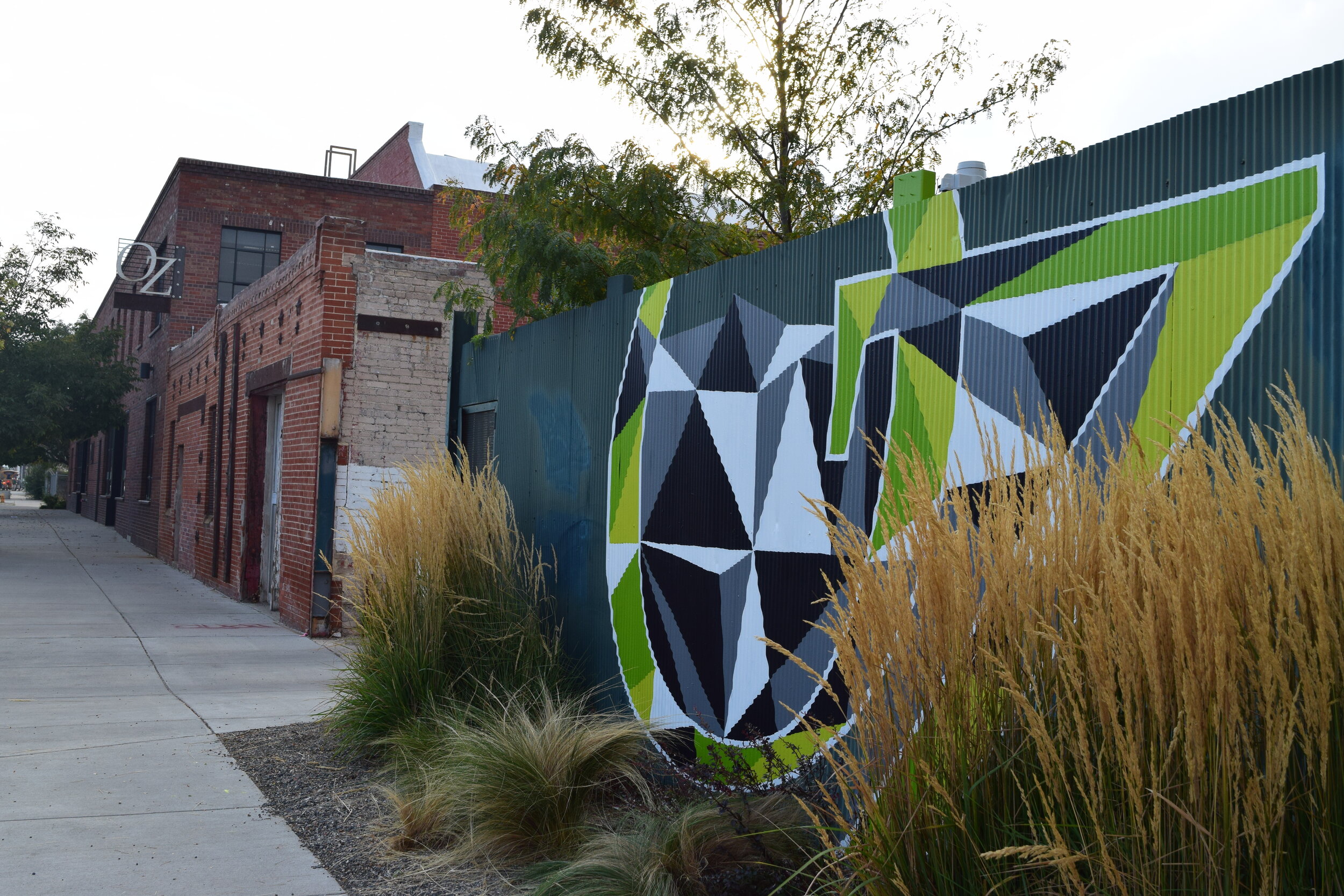
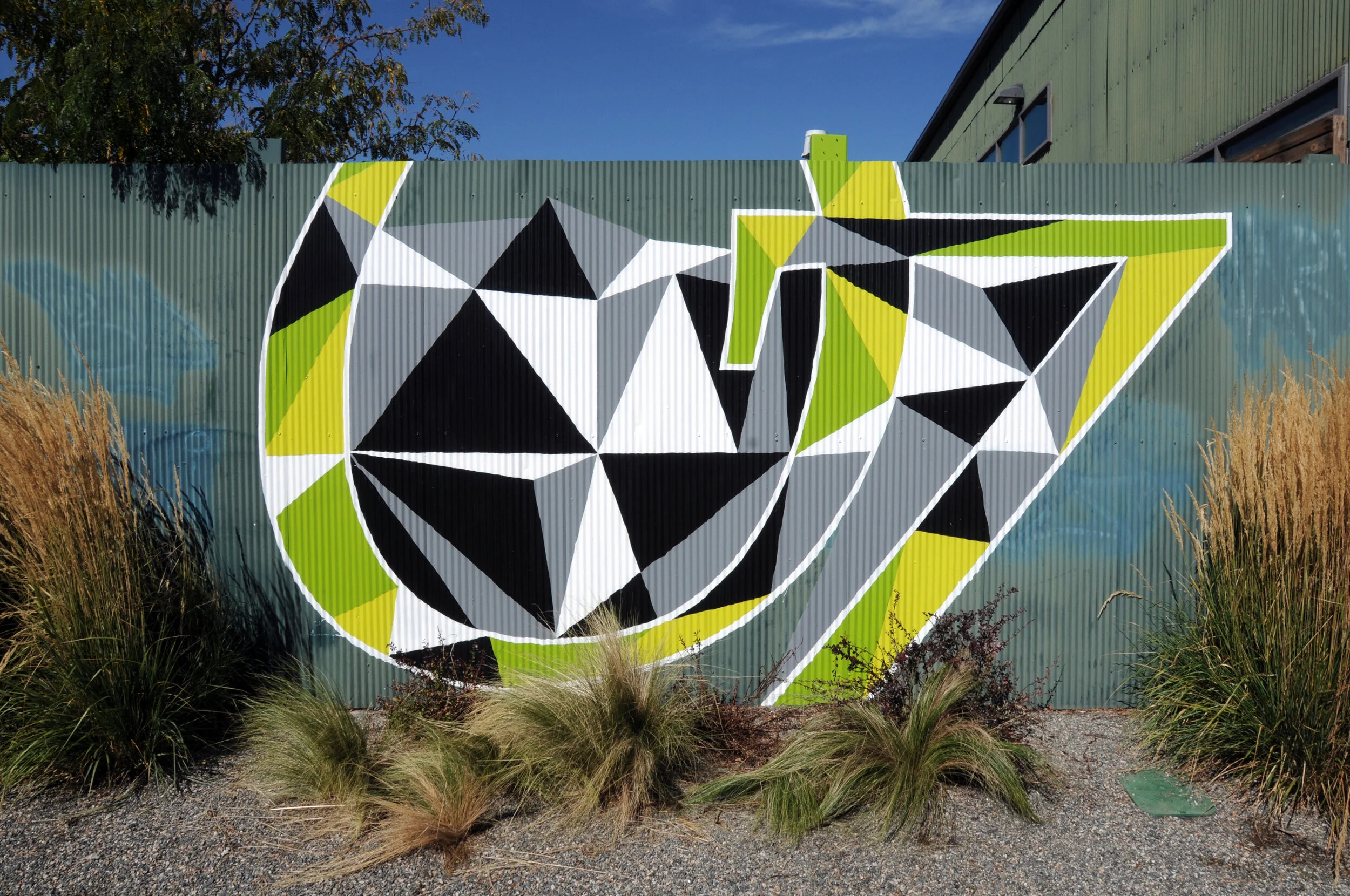
An original, exterior mural was painted on the fencing in between OZ’s two buildings, actively solidifying its place within RiNo.
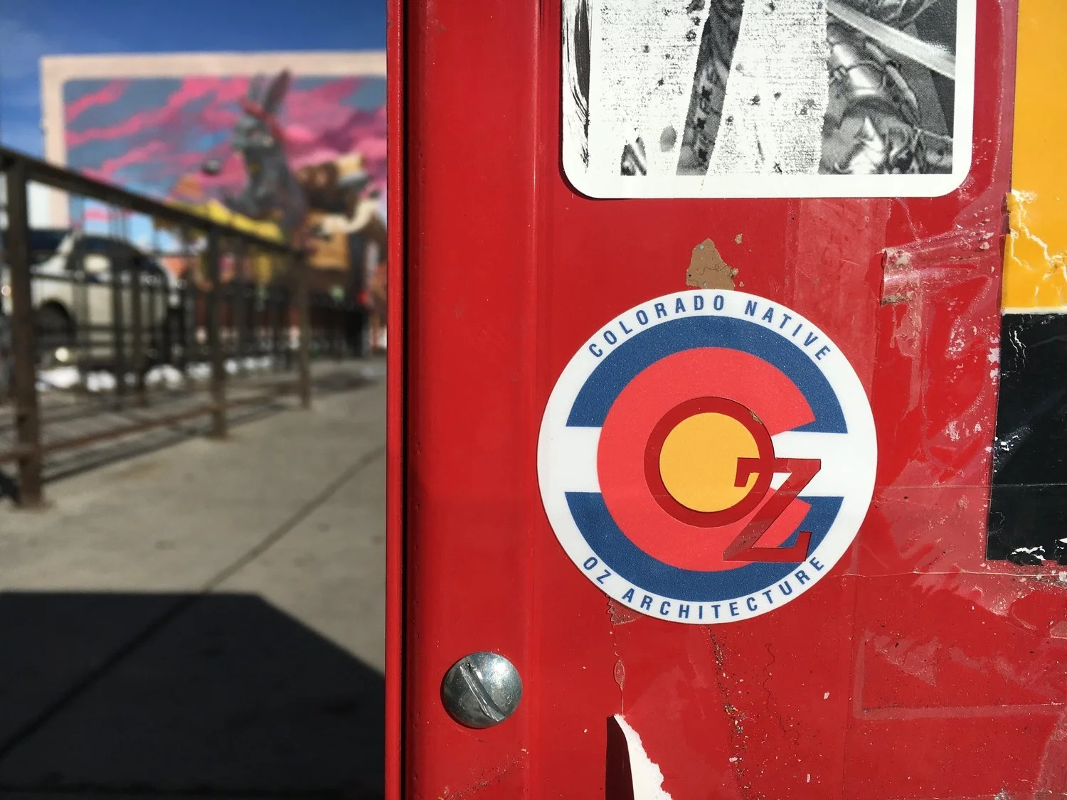
Stickers and patches were added to OZ’s visual language.
THE OUTCOME
The first OZ Art Show brought in 600 visitors and became an annual event showcasing the creativity and interests of the employees. OZ was also named “Best Companies to Work For” in 2015 and 2016 by Colorado Biz Magazine, while RiNo was named “one of the coolest neighborhoods in America” by Lonely Planet and Food & Wine magazines.
WHAT I LEARNED
Brands are living, breathing, multifaceted organisms that need thoughtful iteration over time in order to remain relevant in the eyes of their target audience.